Data Exploration
ONYX Insight specialises in equipping industry professionals with tools to optimise wind turbine performance. They use data from turbine sensors to help customers manage their sites and monitor incoming alarms. As a product designer, my role involves applying design thinking to improve the software provided to customers.
This project aimed to enhance user autonomy over data, provide advanced analytics exploration, and identify energy loss. The approach we took reflects a commitment to merging design innovation with practical customer needs.
Who I worked with
Product Owner
Machine Learning engineers
Monitoring engineers
UI Designer
My Role
UX Research
UX Discovery
UI Design
Product design lead & management
Created for
ONYX Insight and supporting clients
Project Timeline
12 Months
Final Work
See more at bottom of page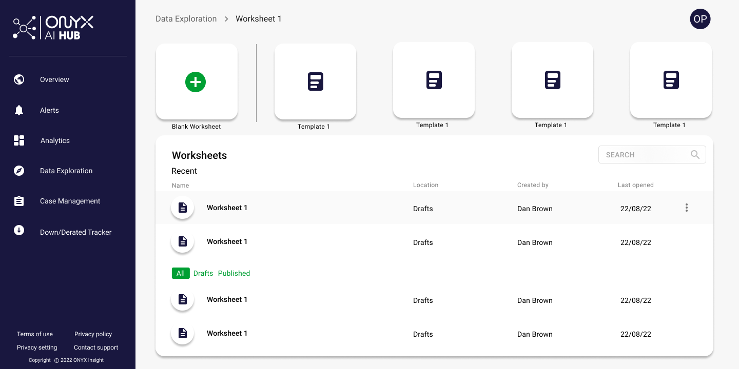
The Challenge
We found that our users needed a space to review alerts coming from the turbine component sensors on their wind farms in much more detail, not being able to do this was stopping them from seeing the bigger picture, including where the problem was coming from and whether there were any similar problems on their farms.
The Goal
The goal of the data exploration design project is to create a user-friendly platform that enables stakeholders to analyse complex datasets effectively. The focus is on clarity, interactivity, and customisation to help users extract valuable insights and make informed decisions from the data. This project aims to enhance strategic planning and decision-making processes through improved data exploration capabilities.
Project Specification
-
Business
Scalable for future improvements
Compete with market space
User
Provide a space for analysts to review alerts in more detail
Allow users to save charts in one space
Functional
Data visualisations must support current data input including time and type
-
Limited time to design and develop
Design much match products existing visual styling
Small development and design team
Design working across multiple projects
User buy in may be low at beginning
-
Monitoring Engineers
Need to review incoming alerts in detail to make decisions regarding best output
Data Analysts
Need to review data in detail relating to specific anomalies or ongoing turbine health problems
Engineering Managers
Need to report to higher ups and monitor site output
Existing Product


The existing offering was limited, there were only two charting options available, the space did not save and the user needed to select multiple dropdowns in order to find data available to view.
Research


We started by interviewing our intended personas to get an idea of their day to day activities including what tools they currently use to analyse data. Once we had built a prototype we later followed up with user testing via an online teams call, which we recorded, watched back and were able to use to iterate the design.
We also spoke to subject matter experts to get an idea of existing examples and best practice within the ML team.
Key Insights:
We found that users had used a group of analytics platforms which let them do basic charting but unfortunately did not fully cover their needs.
Users could not return to the data they had explored as it was not saved in the system
Needed to be able to explore incoming alerts to confirm the issues
Users with little analytical skills would be carrying out analysis so the tool needed to be easy to use
Users were building out their own spaces for reporting purpose
Current system doesn’t allow information to be pushed into a ‘case’
Market
-
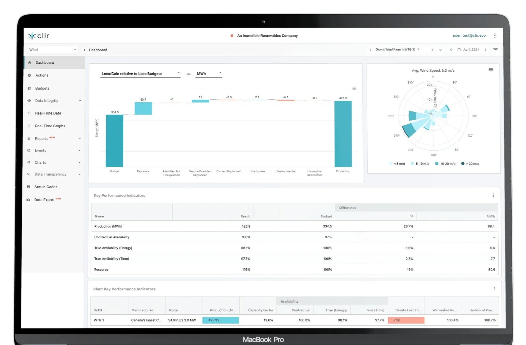
Clir
Pros
Performance issue detection
Reliability issue detection
Cons
Limited data ingestion
No work order or ticketing system
-
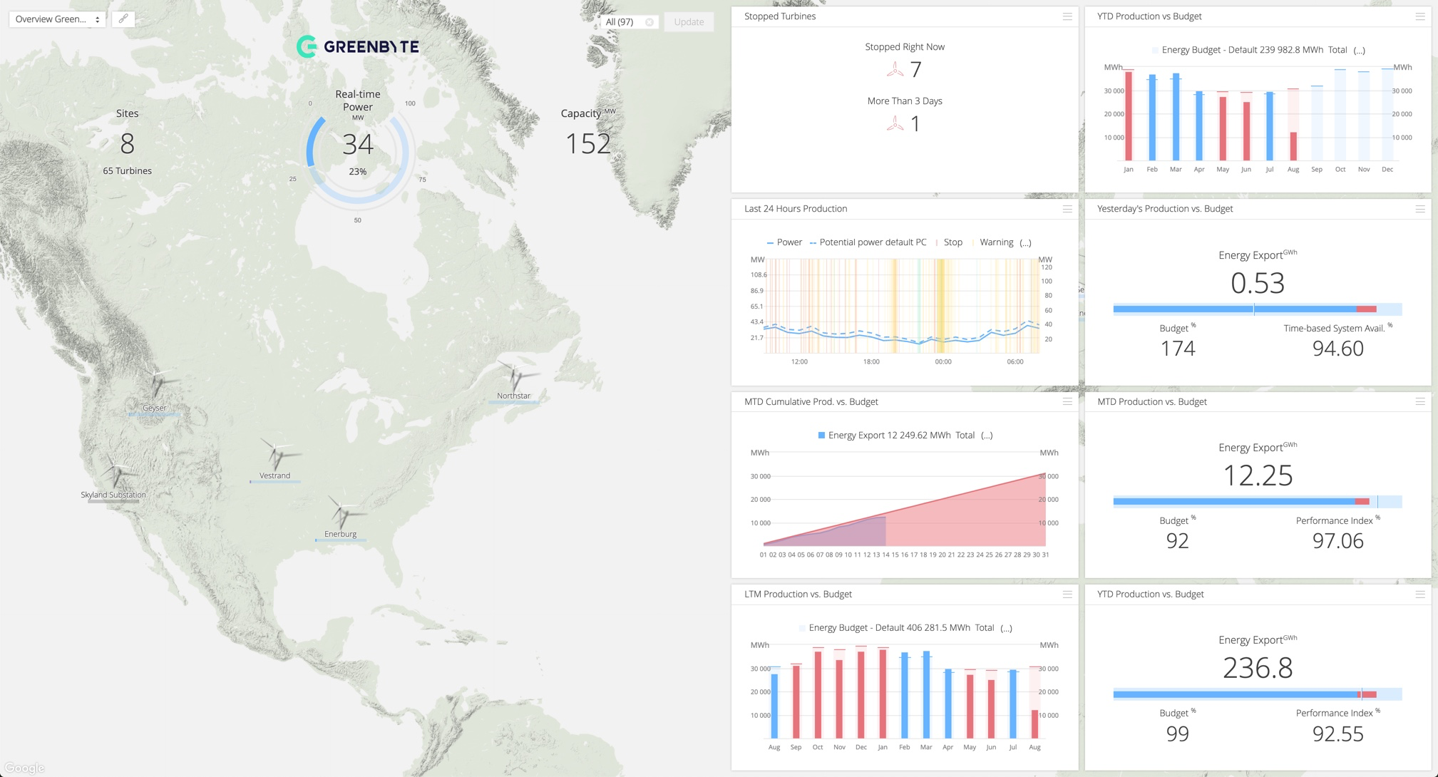
GreenByte
Pros
Performance reporting
Production forecast
Cons
Limited data ingestion
No work order or ticketing system
-
Power Factors
Pros
Full dashboard display
Key KPI dispaly
Multiple XY axis for cross comparison
Performance reporting
Cons
Poor accessibility
Not customisable
No advanced analytics capability
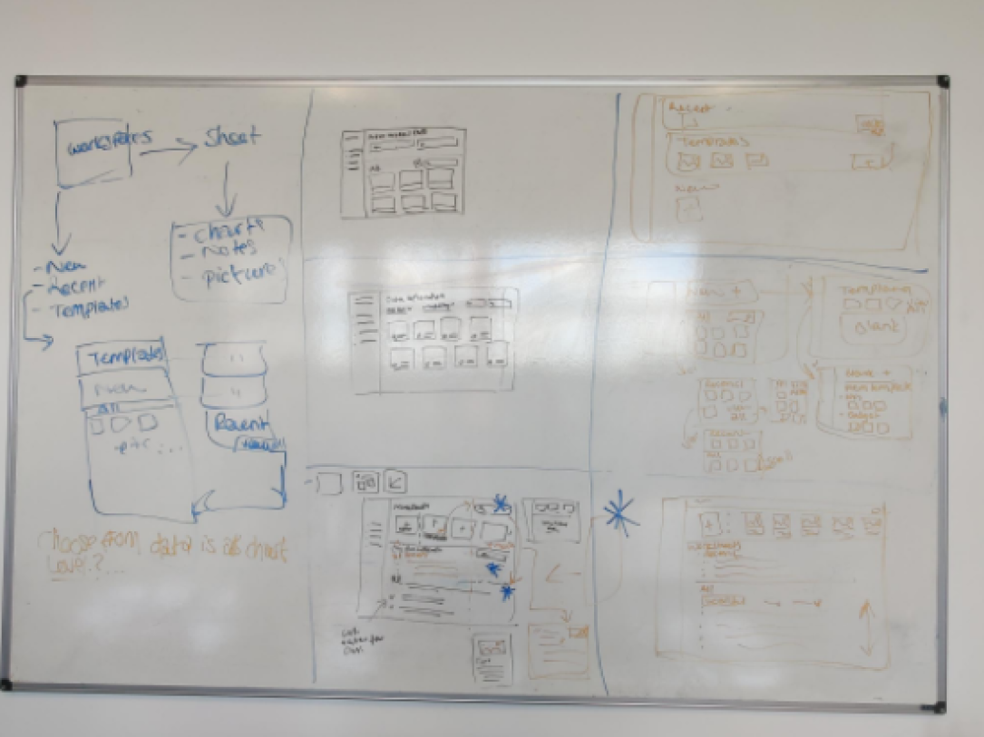
Initial Sketches
We mapped out some quick initial flows and some sketch ideas. We used crazy 8’s to challenge ourselves to come up with different types of screens.
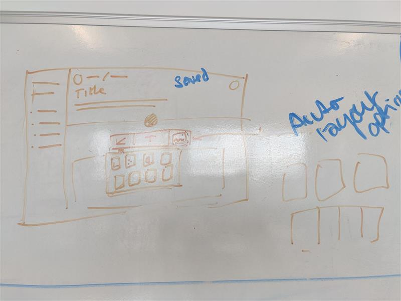
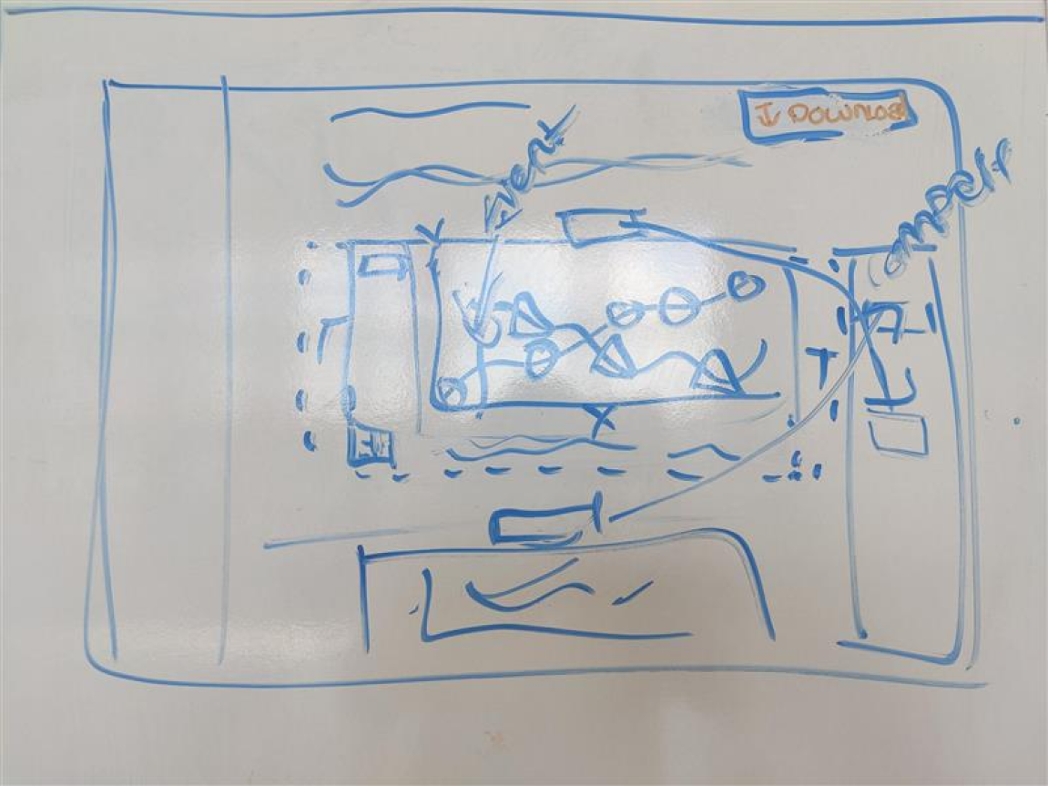
Wireframes


We spent a lot of time working alongside customers, in-house SME’s and different teams at ONYX such as internal monitoring engineers, the ML team, the product owners and development team to ensure that what we were proposing was viable and functionally sound. We also spent a lot of time with our customers to conduct usability testing to identify workflow issues and sticking points.
Once the initial design was built we gathered feedback through providing a beta environment to some of our customers who had requested the tool.
The Solution
After speaking to multiple customers to ensure that we were targeting the correct audience and had identified their problems/ needs in detail we decided to use this project to design a space that could support the needs of multiple personas.
We started off by ideating with monitoring engineers in mind who needed to be able to view incoming alerts in more data to decide whether the alarms needed to be explored in more detail and furthermore a case opening against the problem for an up-tower inspection.
During our conversations we had also spoken to Analysts and Engineering managers and had found they also required access to a space for reviewing data in more detail and also reporting.
We made the decision to design a tool that solved the problem of our key persona, monitoring engineers, but also met some of the needs of our other key platform personas. By utilising this space for multiple purposes, we were able to reduce clutter within the app and use our time more efficiently.
-
![]()
Worksheets page
-
![]()
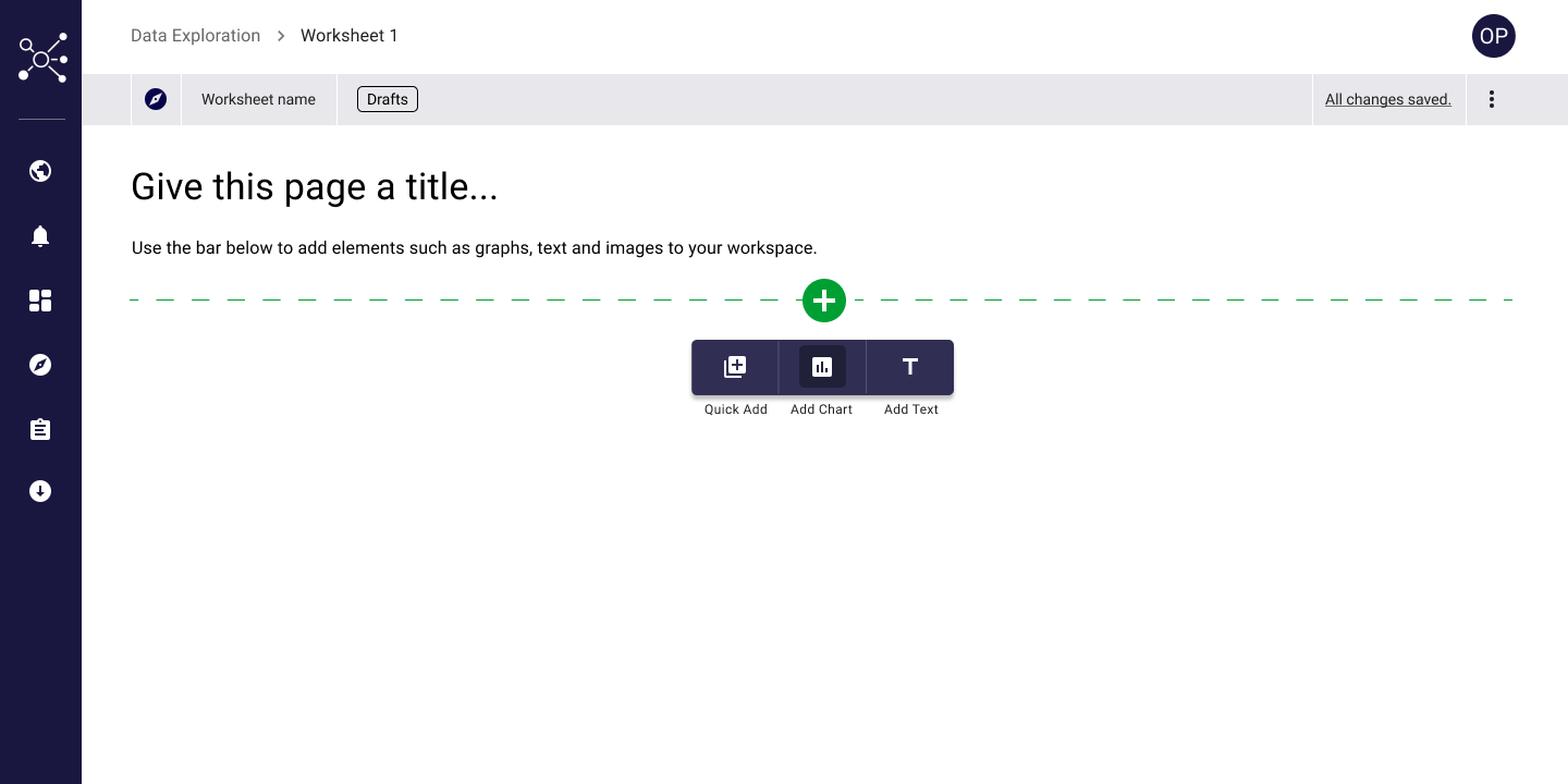
Workspace
-
![]()
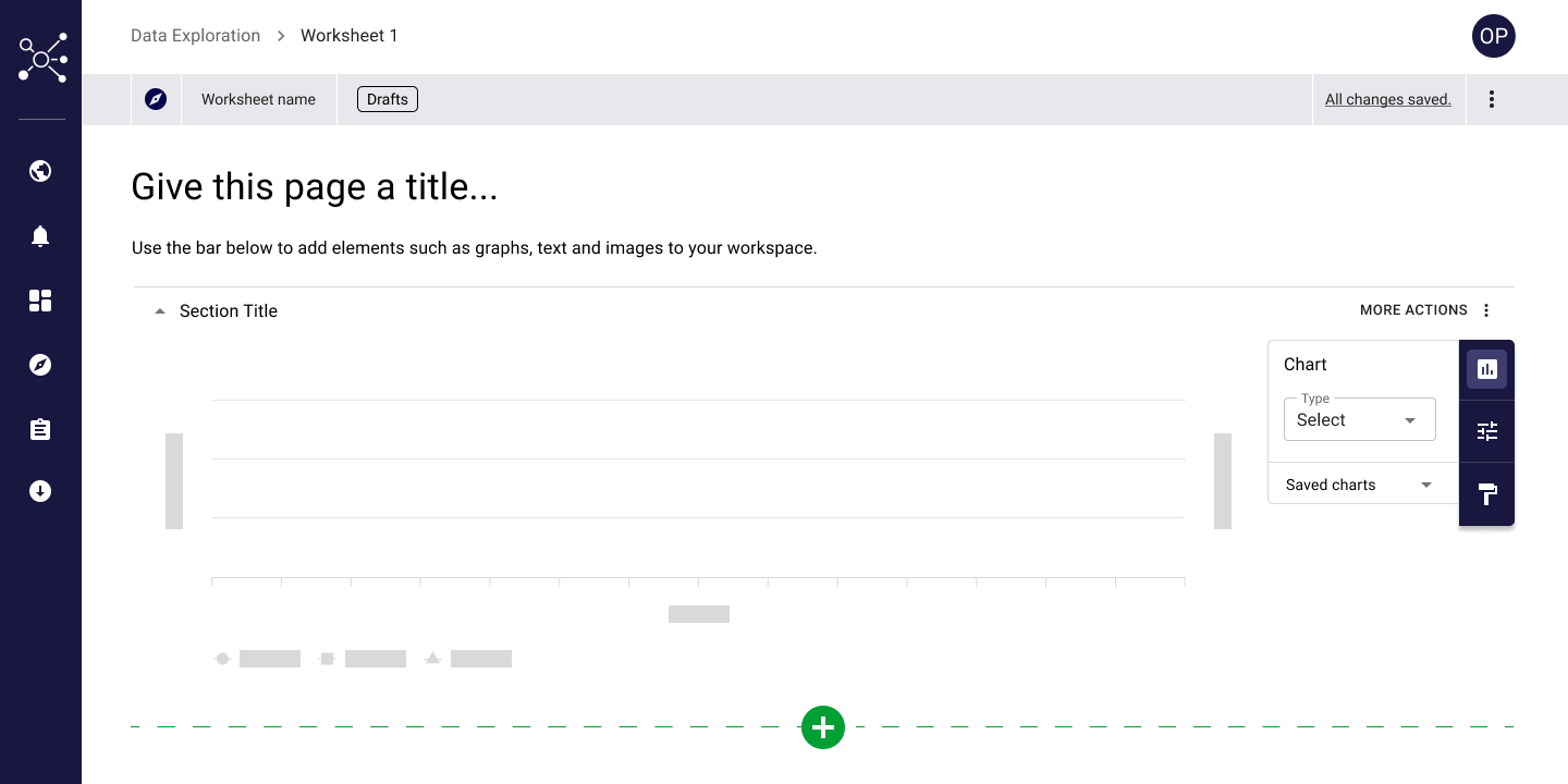
Clear chart with no data
-
![]()
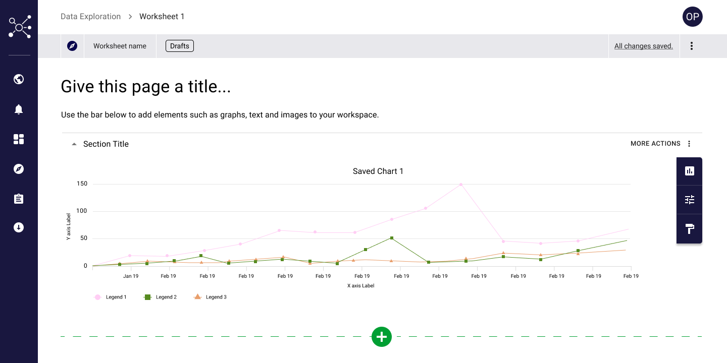
Chart with loaded data
-
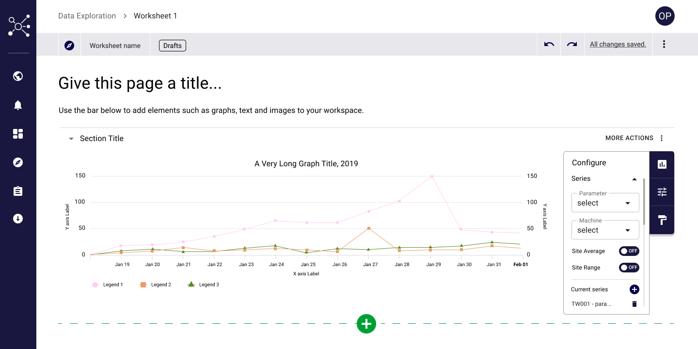
![]()
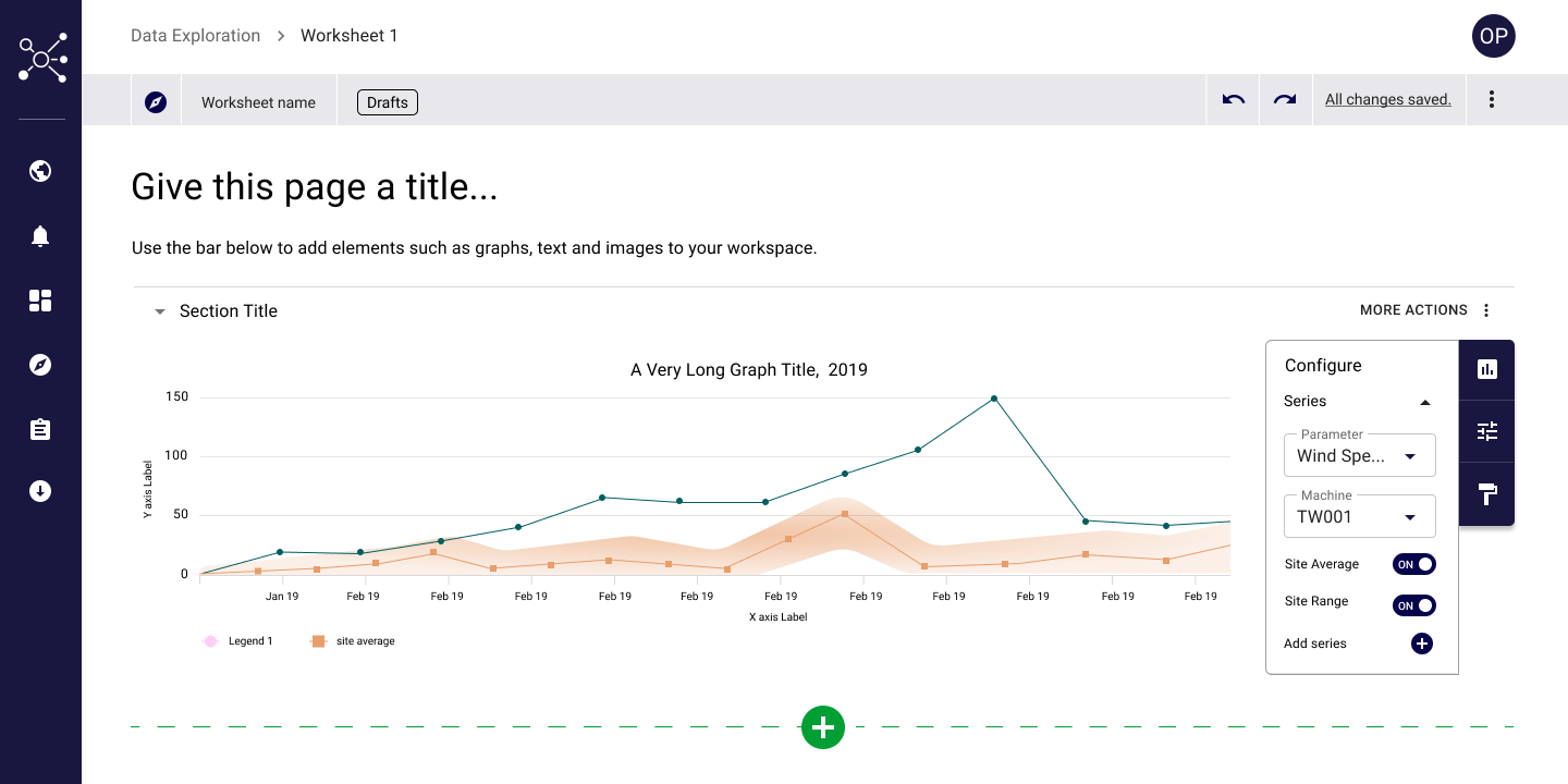
Chart with configure toolbar open